Professional Color Mixing Wheel
Official Store Deal
Expert Analysis Overview
The Professional Color Mixing Wheel is an indispensable educational tool tailored for aspiring artists and seasoned professionals seeking to refine their understanding of color relationships. This tangible guide offers a foundational yet comprehensive approach to color theory, moving beyond abstract concepts to provide immediate, actionable insights for pigment selection and blending across various artistic disciplines. Unlike digital color pickers that can be influenced by screen calibration, this physical wheel provides a consistent, reliable reference point for real-world application.
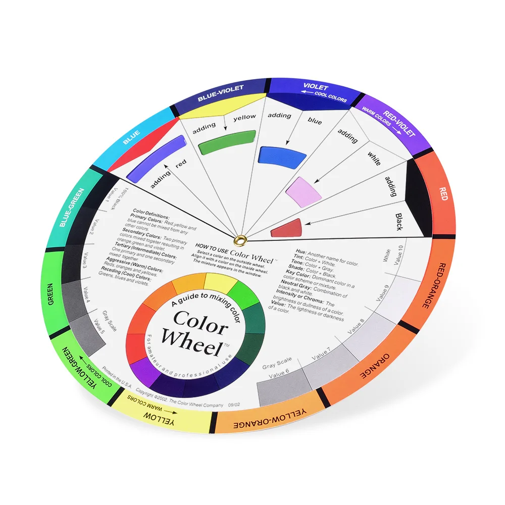
This color wheel clearly illustrates the 12-color spectrum, segmenting it into primary, secondary, and tertiary hues. Primary colors—red, yellow, and blue—form the absolute basis of all other colors. They cannot be created by mixing other pigments. Understanding these fundamental building blocks is crucial for any artist.
Secondary colors, such as orange, green, and violet, are derived from mixing two primary colors in equal proportions. Orange results from red and yellow, green from yellow and blue, and violet from blue and red. This progression is clearly mapped on the wheel, offering a quick visual reference for mixing.
Tertiary colors, like red-orange or blue-green, are created by combining a primary color with an adjacent secondary color. The wheel's design intuitively guides users through these relationships, preventing guesswork. It’s a simple, effective way to grasp complex color interactions.
The central, rotatable disc is the heart of this tool, allowing for dynamic exploration of color harmony. By aligning a specific color on the outer ring with the inner wheel, users can instantly identify complementary colors. These are colors directly opposite each other on the wheel, such as red and green, or blue and orange. Complementary colors, when placed next to each other, create maximum contrast and vibrancy, making them invaluable for creating focal points in designs.
Imagine a tattoo artist attempting to create a vibrant, contrasting piece. Without a solid understanding of complementary colors, the final result could appear flat or muddy. This wheel provides that instant visual aid. It prevents costly mistakes in pigment selection, especially critical when working on skin where color correction is complex.
The wheel also outlines analogous color schemes, which consist of three colors next to each other on the wheel. These combinations are inherently harmonious and often found in nature, creating a sense of calm and visual unity. For a nail artist designing a subtle gradient, an analogous scheme offers a foolproof path to elegance. This approach ensures color choices always feel balanced.
Furthermore, the wheel demonstrates triadic color schemes, involving three colors evenly spaced around the wheel. These schemes are bold and vibrant, offering a strong visual impact while maintaining balance. Artists can quickly identify these combinations for projects requiring high energy and clear distinction.
The color wheel extends its utility by providing visual examples of tints, tones, and shades for each hue. A tint is created by adding white to a pure color, making it lighter and softer. Tones are produced by adding gray, which reduces the color's intensity and saturation, making it appear more muted. Shades are formed by adding black, resulting in a darker, richer version of the original color. This visual breakdown is fundamental for achieving depth and dimension in any artwork.
For tattoo artists, understanding tints and shades is paramount for creating smooth transitions and realistic depth in portraits or intricate designs. The ability to quickly reference how a color changes with the addition of white, black, or gray allows for precise mixing. It ensures consistency across different areas of a design, a critical aspect of professional work.
Consider a scenario where a painter needs to depict shadows accurately. Rather than simply adding black, which can often dull a painting, referencing the shades on the wheel can guide the artist to mix the correct darker version of the base color, maintaining its vibrancy. This nuanced understanding elevates the quality of the final piece. The visual aids make this process intuitive.
The Professional Color Mixing Wheel is constructed from laminated cardstock, providing a tactile learning experience that digital screens cannot replicate. The physical act of rotating the disc and seeing the relationships unfold directly improves retention. Its glossy finish protects the printed colors from minor spills and smudges, an important consideration in a busy studio environment. This material choice ensures longevity.
Despite its robust construction, the wheel remains lightweight and portable, easily fitting into an artist's kit or a student's backpack. This portability means the essential knowledge of color theory is always within reach. It allows for quick reference during client consultations or while working on location.
Compared to flimsy paper charts, the laminated cardstock offers significantly improved durability, resisting tears and creases during frequent handling. The clear, high-definition printing ensures that color distinctions are sharp and easy to discern, even under varying lighting conditions. This attention to detail makes the tool a reliable companion for years.
This color wheel is an invaluable asset for tattoo artists who must meticulously mix pigments to achieve desired effects and ensure longevity on skin. Understanding how colors interact prevents the dreaded
Decoding the Spectrum
This color wheel clearly illustrates the 12-color spectrum, segmenting it into primary, secondary, and tertiary hues. Primary colors—red, yellow, and blue—form the absolute basis of all other colors. They cannot be created by mixing other pigments. Understanding these fundamental building blocks is crucial for any artist.
Secondary colors, such as orange, green, and violet, are derived from mixing two primary colors in equal proportions. Orange results from red and yellow, green from yellow and blue, and violet from blue and red. This progression is clearly mapped on the wheel, offering a quick visual reference for mixing.
Tertiary colors, like red-orange or blue-green, are created by combining a primary color with an adjacent secondary color. The wheel's design intuitively guides users through these relationships, preventing guesswork. It’s a simple, effective way to grasp complex color interactions.
Navigating Color Relationships
The central, rotatable disc is the heart of this tool, allowing for dynamic exploration of color harmony. By aligning a specific color on the outer ring with the inner wheel, users can instantly identify complementary colors. These are colors directly opposite each other on the wheel, such as red and green, or blue and orange. Complementary colors, when placed next to each other, create maximum contrast and vibrancy, making them invaluable for creating focal points in designs.
Imagine a tattoo artist attempting to create a vibrant, contrasting piece. Without a solid understanding of complementary colors, the final result could appear flat or muddy. This wheel provides that instant visual aid. It prevents costly mistakes in pigment selection, especially critical when working on skin where color correction is complex.
The wheel also outlines analogous color schemes, which consist of three colors next to each other on the wheel. These combinations are inherently harmonious and often found in nature, creating a sense of calm and visual unity. For a nail artist designing a subtle gradient, an analogous scheme offers a foolproof path to elegance. This approach ensures color choices always feel balanced.
Furthermore, the wheel demonstrates triadic color schemes, involving three colors evenly spaced around the wheel. These schemes are bold and vibrant, offering a strong visual impact while maintaining balance. Artists can quickly identify these combinations for projects requiring high energy and clear distinction.
Exploring Tints, Tones, and Shades
The color wheel extends its utility by providing visual examples of tints, tones, and shades for each hue. A tint is created by adding white to a pure color, making it lighter and softer. Tones are produced by adding gray, which reduces the color's intensity and saturation, making it appear more muted. Shades are formed by adding black, resulting in a darker, richer version of the original color. This visual breakdown is fundamental for achieving depth and dimension in any artwork.
For tattoo artists, understanding tints and shades is paramount for creating smooth transitions and realistic depth in portraits or intricate designs. The ability to quickly reference how a color changes with the addition of white, black, or gray allows for precise mixing. It ensures consistency across different areas of a design, a critical aspect of professional work.
Consider a scenario where a painter needs to depict shadows accurately. Rather than simply adding black, which can often dull a painting, referencing the shades on the wheel can guide the artist to mix the correct darker version of the base color, maintaining its vibrancy. This nuanced understanding elevates the quality of the final piece. The visual aids make this process intuitive.
Tactile Learning and Durability
The Professional Color Mixing Wheel is constructed from laminated cardstock, providing a tactile learning experience that digital screens cannot replicate. The physical act of rotating the disc and seeing the relationships unfold directly improves retention. Its glossy finish protects the printed colors from minor spills and smudges, an important consideration in a busy studio environment. This material choice ensures longevity.
Despite its robust construction, the wheel remains lightweight and portable, easily fitting into an artist's kit or a student's backpack. This portability means the essential knowledge of color theory is always within reach. It allows for quick reference during client consultations or while working on location.
Compared to flimsy paper charts, the laminated cardstock offers significantly improved durability, resisting tears and creases during frequent handling. The clear, high-definition printing ensures that color distinctions are sharp and easy to discern, even under varying lighting conditions. This attention to detail makes the tool a reliable companion for years.
Practical Application in Artistry
This color wheel is an invaluable asset for tattoo artists who must meticulously mix pigments to achieve desired effects and ensure longevity on skin. Understanding how colors interact prevents the dreaded